The latest update of PLANERGY will be released soon and an important part of this update will be changes to the design of the PLANERGY application. This improves the look and feel of the software to make it easier to use.
These changes have been planned to minimise their impact on how you are used to using PLANERGY but there are some changes that you need to be aware of. Below we explain the changes but if you are having any problems completing a task in PLANERGY please contact our support team and they will be happy to help.
New Design
Full Screen Layout For Large Screens
PLANERGY has always used a responsive design (it resizes automatically to fit the screen size you are using), but on larger screens it did not make full use of the screen width. The new design will use the full width of the screen you are using making it easier to use.
Navigation Updates
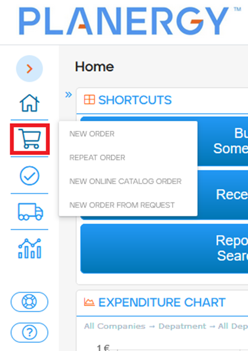
Left Side Menu
The main menu on the left of the screen has been updated. There are icons added for each group of pages and the entire menu can be minimized to free up additional horizontal space. There are a few important things to know about how the menu will behave differently to the old main menu.
Collapsible Menu
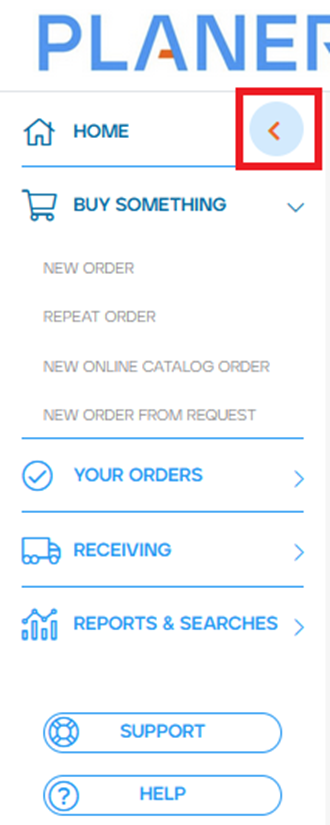
Using the circle with the orange arrow at the top of the menu you can expand or collapse the menu.

Accessing Sub-Menus
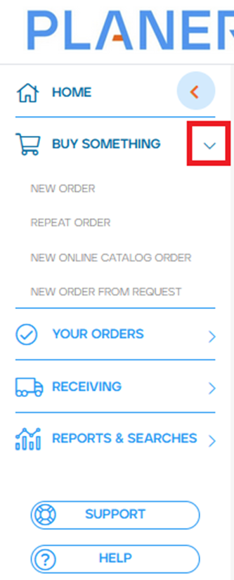
If the menu is expanded only one submenu will be open at any given time. You can press the arrows on the right of the menu to open the section and see the additional menu options for that grouping.
If the menu is collapsed the submenu will appear when you hover over the relevant icon in the menu.
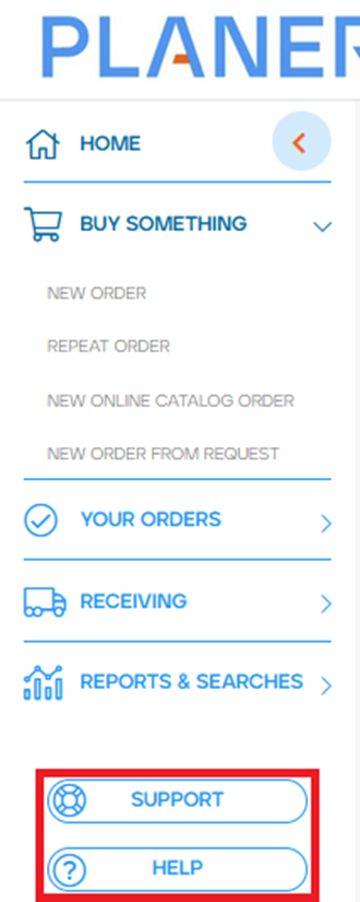
Help and Support buttons
The help and support buttons previously appeared at the very far left of the screen, these are now added at the bottom of the left side menu.
Old Layout
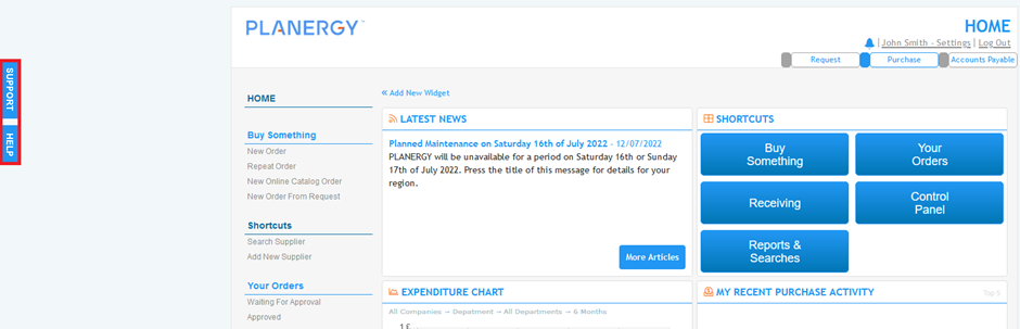
New Layout
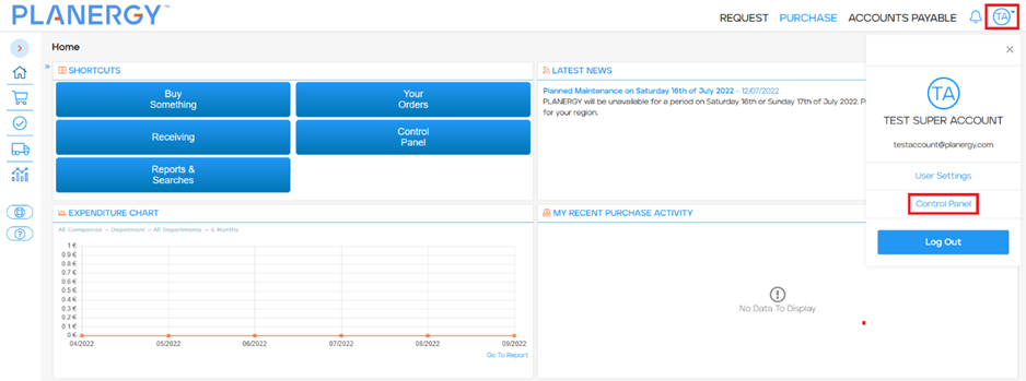
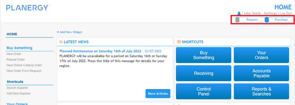
Control Panel button moved
The button to access the Control Panel previously appeared in the left side menu. It has now been moved under the User Profile section in the header menu.
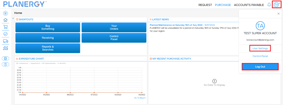
To access the Control Panel you now need to use the profile menu. This is accessed from a circle with the first letter from your first name and first letter from your second name at the right-hand side of the header menu. Pressing the icon will display the additional options below it and Control Panel is included here.
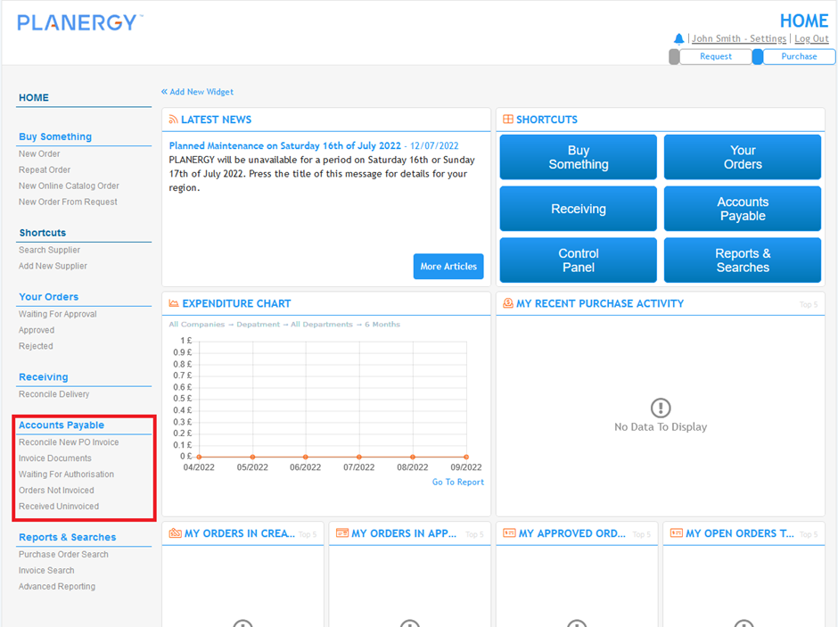
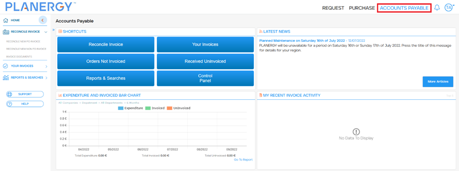
Accounts Payable menu options
For some users who have been using PLANERGY for many years you will be used to seeing Accounts Payable options in this menu.
When we introduced AP Automation functionality this greatly expanded the Accounts Payable functionality available in PLANERGY but your menu was not updated to reflect this. With the release of the new design the menu has been standardized and the Accounts Payable options are now found in a separate Accounts Payable module.
If you would like to learn more about PLANERGY’s Accounts Payable Automation, please contact the support team for more information.
Old Layout
New Layout
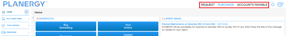
Header Menu
Module Navigation
The links to access different PLANERGY modules are located in a similar place to where they were available in the old design but the look and feel of these has been changed.
Old Layout
New Layout
Logout and User Settings
The logout and user settings options were always visible on screen in the old design. To access these options now you need to use the profile menu (a circle with the first letter from your first name and first letter from your second name). Pressing the icon will display the additional options below it.
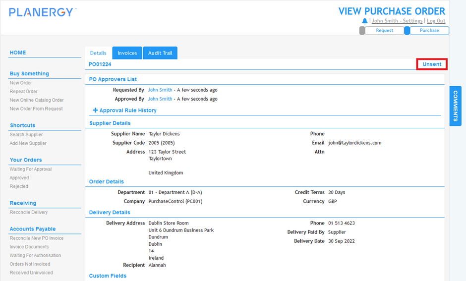
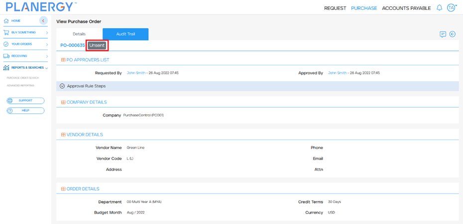
Order View/Edit Page
Order Status
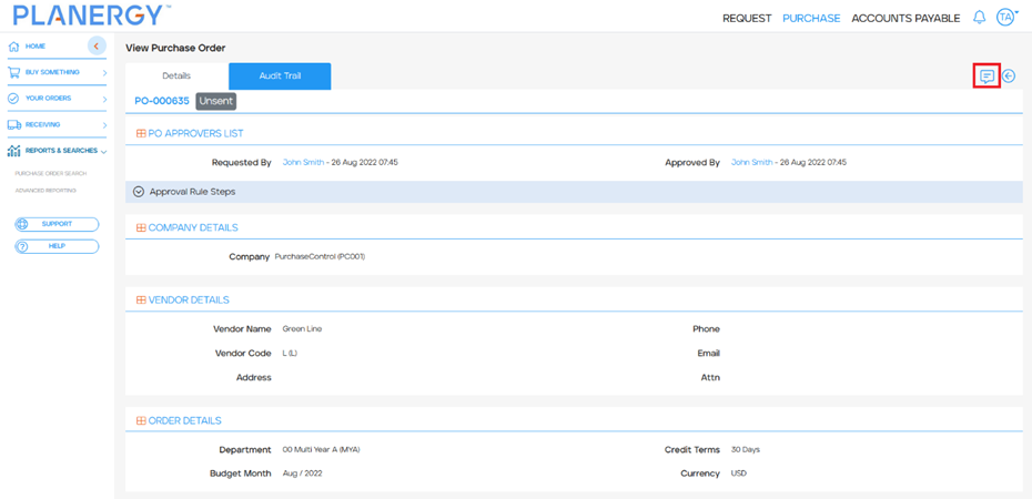
Order status now appears next to the requisition or purchase order number.
Old Layout
New Layout
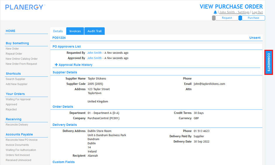
Comments
The comments section that previously appeared on the far right of the screen now appears at the top right corner of the document.
Old Layout
New Layout
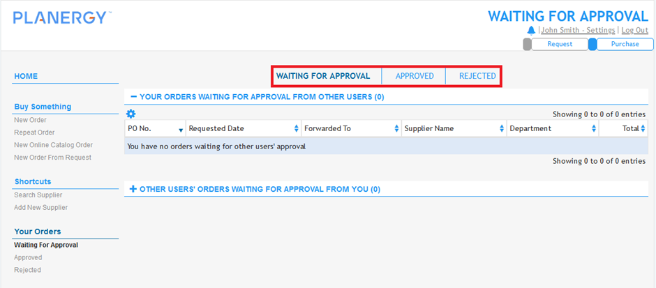
Your Orders
The tabbed navigation to move between Waiting For Approval, Approved, and Rejected pages has been removed. You can access each of these from the main left side menu.
Old Layout
Receiving
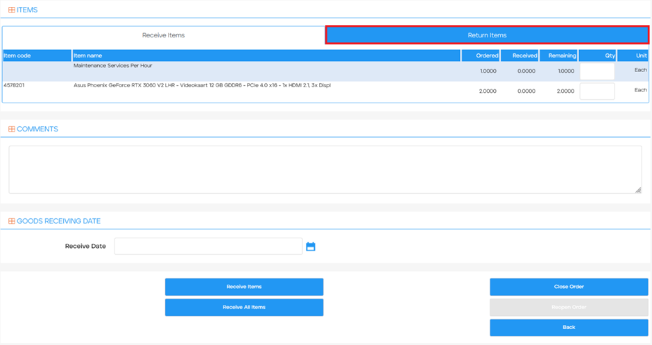
The receiving page is now split into 2 separate tabs for receiving and returning. Previously it was possible to return items and receive items. To return items you now have to open the Return Items tab and you will see the options to return items.
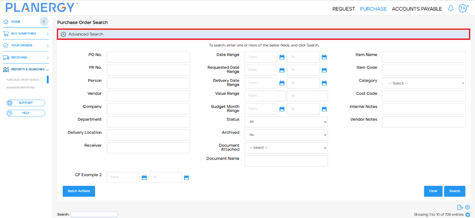
Search Pages
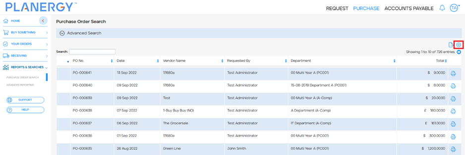
The standard search pages, this includes Purchase Order Search and Invoice Search, are all updated with similar changes.
Quick Search
Quick Search is now available, this allows you to search based on any information quickly with a single input field. This searches across all data.
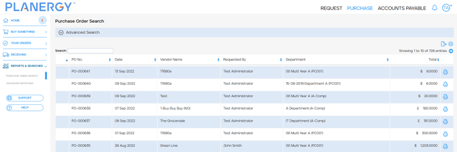
All other search filters are hidden under the Advanced Search expander. You can open this by clicking anywhere on the section. This will reveal all of the search filters for searches or exports.
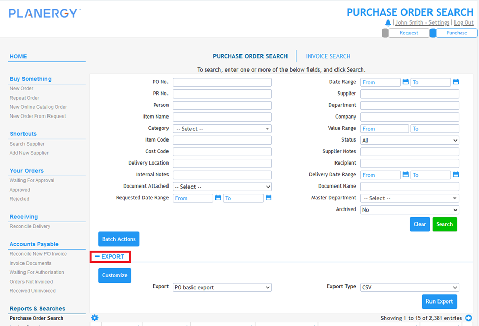
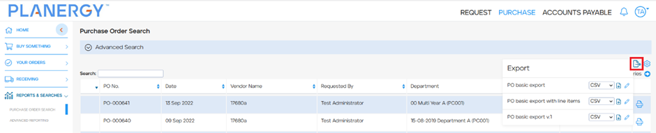
Export
The location of the export options have moved to the top right of the search results table.
Old Layout
Search Results Settings
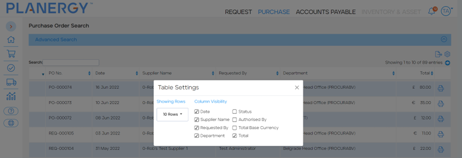
The options for configuring how the search results appear has been moved and is now available on the top right, above the search results table.
Old Layout
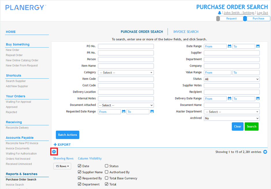
New Layout
This opens a popup where you can change the display settings for the search results table.
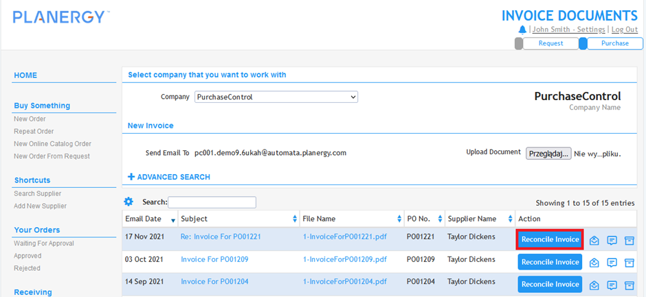
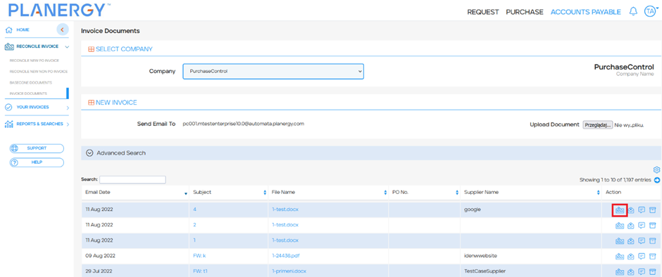
Invoice Documents Search
Reconcile Invoice Button
The Reconcile Invoice button is located in the same place it was before but now uses an icon.
Old Layout
New Layout
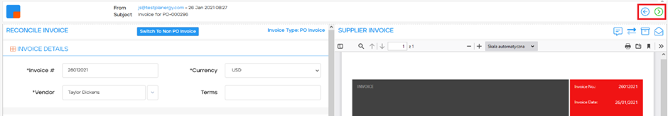
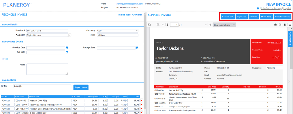
Reconcile New Invoice
Supplier Invoice Panel Buttons
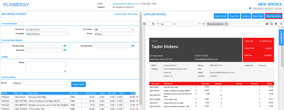
The buttons used to interact with the invoice document have been updated to use icons. The same options are available and appear in the same order as in the old layout except the ‘Next Document’ button has been moved to the Header Section.
Old Layout
New Layout
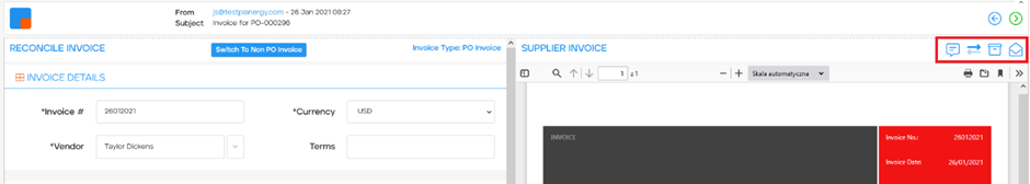
Header Section
This has been updated to have navigation options to move to the next and previous invoice document. Previously these were available in the buttons in the Supplier Invoice Panel.
Old Layout
New Layout